Introduction: The 300K Difference That Redefines Your Atmosphere
Light is the most important final finish in high-end interior design that will make or break your investment. You can pay a fortune on Italian marble, custom made wood work, and high-quality crystal-white glass, but they will never show the real quality under a brighter light or a different color temperature (CCT). The most controversial decision in a lighting plan is whether to use 2700K or 3000K since 300 Kelvins are the physical limit between a warm nest and a contemporary gallery, making it crucial to make an informed decision.
Choosing the incorrect CCT is a cardinal mistake that is challenging and costly to correct in the future. The rationale is as follows: at first glance, a 2700K light in a high-tech kitchen will cause the white quartz to appear muddy and old-fashioned instead of crisp, whereas the 3000K light in a traditional bedroom will seem intensely sharp at a time when you are supposed to be feeling relaxed, which can increase energy consumption. This guide offers the logical structure in which to go about this selection so that your lighting is in harmony with your vision, not working against it.
2700K vs. 3000K: Decoding the Visual Psychology
We need to know how color is perceived by the brain first before we can select the right lighting. Lighting does not only entail seeing but also feeling, including the perception of cooler colors. The human body has been programmed to react to the spectral variations of the sun, i.e. every Kelvin decision causes a particular psychological reaction.
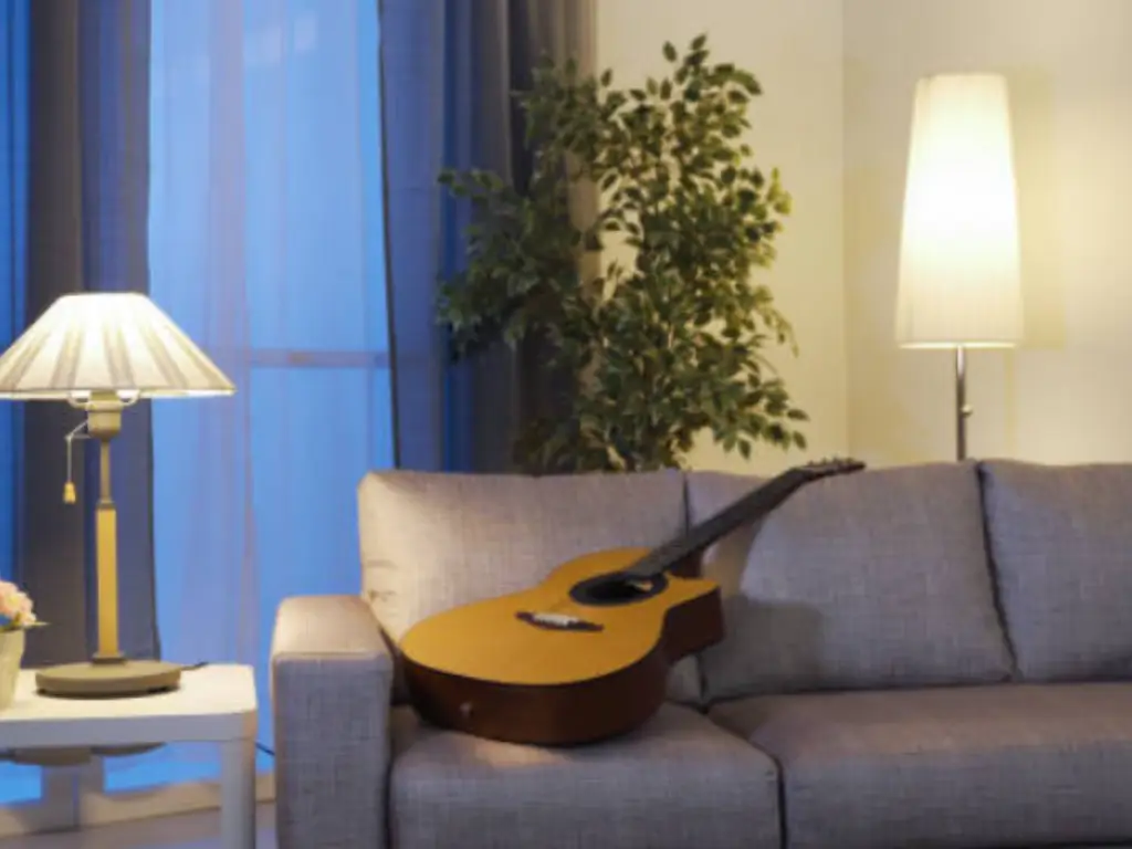
2700K: The Warmth of Heritage
The nearest substitute to the traditional incandescent bulb is 2700K. It is full of orange and red colors, and our biology correlates them with the sunset. This light sends relaxation signals to the brain, thus inviting it to rest by stimulating the production of melatonin. In professional design, 2700K is employed to form visual weight – it makes a popular choice for creating a feeling of anchoring, safety, and privacy in a room. It is remarkably tolerant to skin tones and gives a feeling of the old-world luxury, which is barely achievable with cooler lights that often have a yellowish hue. It transforms a house into a home by giving it a psychological feeling of being enclosed.
3000K: The Crispness of Modernity
What we refer to as Soft White or Halogen White is 3000K, a neutral white color temperature of your light. The yellow undertones are much more toned down as well, with a much whiter base taking the place of them. This gives what we professionals refer to as visual acuity; the capacity to observe edges, textures and minute detail with greater clarity. 3000K makes a space feel energized and up to date. It is chosen in favor of the modern architecture where neatness, accuracy, and a sense of freshness are the main objectives. It provides an alert comfort environment, which is appropriate in areas that are neither overly productive nor too living.
2700K vs. 3000K in Diverse Scenarios: From Homes to Infrastructure
Each room has a varying job to perform and the lighting should be based on the task. A universal approach to CCT usually leads to a space that incorporates warm tones and suitable light color, which is either too sterile or too relaxing.
The Residential Strategy
The single house color temperature is hardly the best solution in a luxurious house.
- Living Rooms & Bedrooms: 2700K. These are decompression areas. The glow of the amber supplements the effect of the cocoon, and the space is more intimate and silent.
- Kitchens & Bathrooms: Change to 3000K. The real color of food should be visible during the cooking process, and you should have a neutral and clean light in the bathroom to groom up, not to have a yellowish effect of the warmer lights.
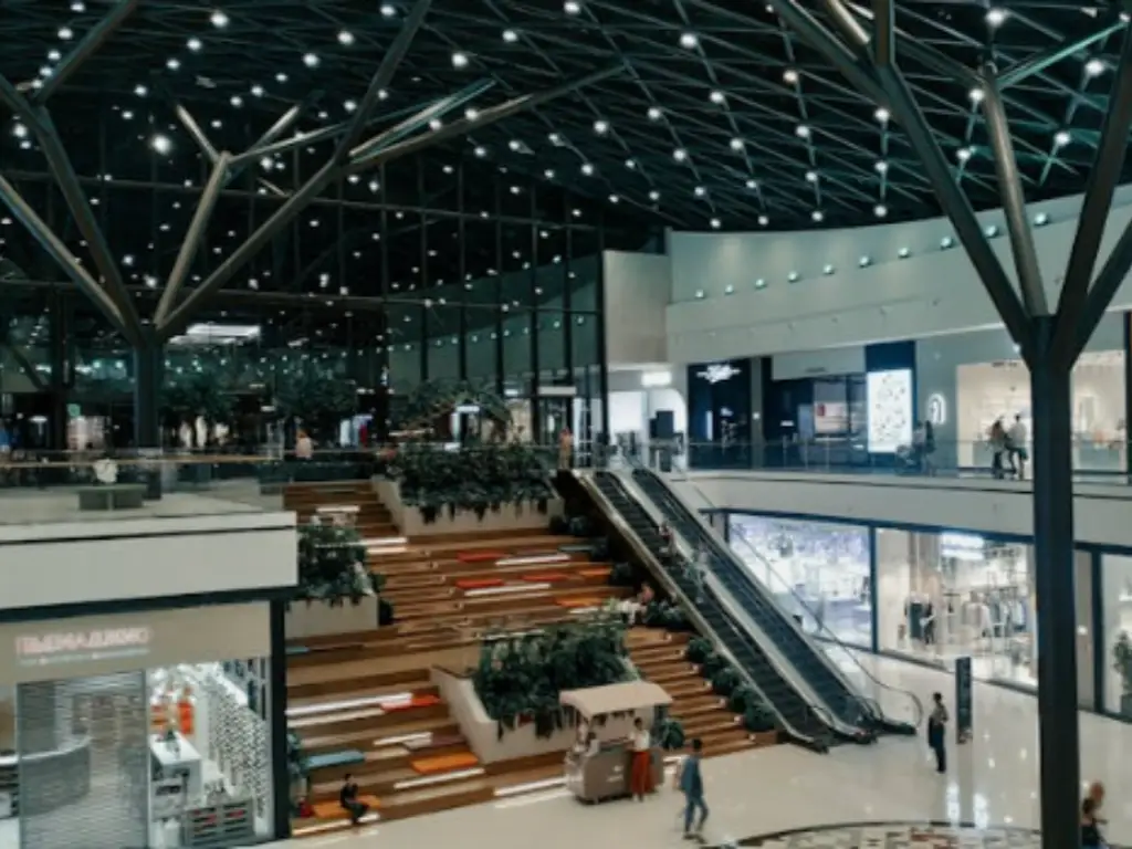
Commercial & Retail Excellence
Light is a strategic asset in commercial spaces and retail settings as opposed to an ordinary utility. In this case, 3000K is the standard that is used in both commercial spaces and retail space due to the fact it is a good compromise between a comfortable feel and an inviting atmosphere of business clarity.
- The Display Commercial: 3000K has the sharpness needed to emphasize product quality. Although 2700K may cause the surfaces to appear slightly aged or yellowed, the key difference lies in that 3000K will hold a neutral canvas to highlight the true colors and texture of the merchandise. It offers the visual POP that will attract the attention of a customer, making it a better choice without the coldness of cooler lights.
- Productivity in the office: Some studies indicate that 3000K is less straining and fatigating on the eye as compared to the more bulky yellow, 2700K that emits a soft, warm glow. It is regarded as the Goldilocks zone of digital workspace lighting options – it is bright enough to offer enough mental stimulation to last long without being as sterile as a hospital, or as sleepy as a bedroom.
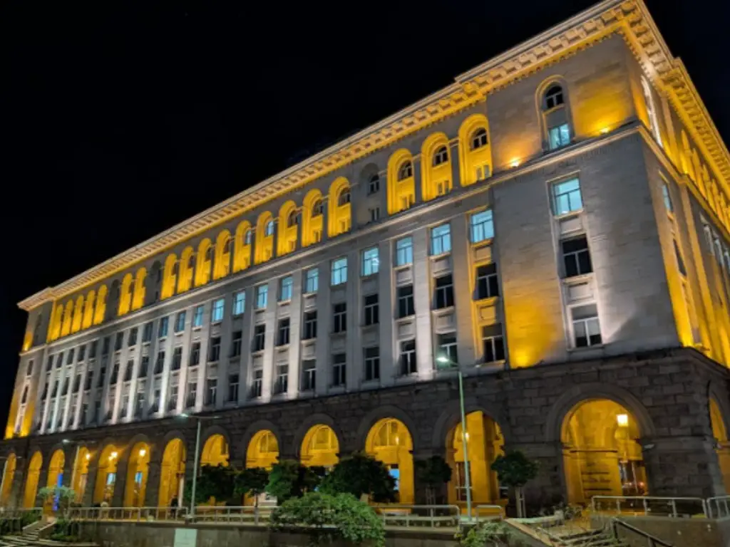
H3: Outdoor & Architectural Identity
The color temperature is used in outdoor lighting as the visual language that identifies a structure in the dark, enhancing the overall experience of the environment. To make the best choice, the reasoning behind this is the period and reflective characteristics of the material.
- Infrastructure modern: In the case of contemporary with stone, glass, and steel, 3000K is the best option. It gives a sharp look of the shimmer, which adds clean architectural lines and improves glass transparency. This chillier climate also encourages the modern security guardedness, allowing for neutral tones that enhance vigilance in the streets.
- Landscape & Heritage: In natural landscapes and historic and heritage sites, 2700K light bulbs are the standard of the profession. Its amber-basing range provides a touch of “soul” to traditional brick work and other natural materials such as trees. It maintains the historical integrity of the site so that it does not get washed out or clinical in an artificial sense.
Matching 2700K vs. 3000K with Your Materials: A Selection Guide
The last finish on your materials is light. The spectral power of the source of light reacts differently to every surface, so your warm lighting should be paired with your palette of materials to guarantee color faithfulness. An example: white marble and cold metals need 3000K to be kept in their cool, dispassionate whiteness, since lighter temperatures may cause these surfaces to look worn or even muddy. On the other hand, the deep red and orange undertones that rich wood grains and brass touches are triggered by 2700K to produce a saturated glow, which is impossible not to deem as luxurious. Even clear materials such as crystal glass change their identity under this option with 3000K creating maximum refractive sparkle and 2700K having a lower antique, smooth look.
| Material & Finish | Recommended CCT | Visual Outcome |
| Warm Woods & Gold/Brass | 2700K | Deepens grains; creates a rich, candlelight glow in your outdoor space. |
| White Marble & Quartz | 3000K | Keeps whites pure; prevents a “dirty” yellow cast. |
| Premium Glass & Crystal | 3000K | Maximizes clarity and enhances refractive sparkle. |
| Chrome & Stainless Steel | 3000K | Highlights the sleek, high-tech reflective nature. |
| Modern Greys & Blues | 3000K | Ensures color fidelity; prevents shifting to green. |
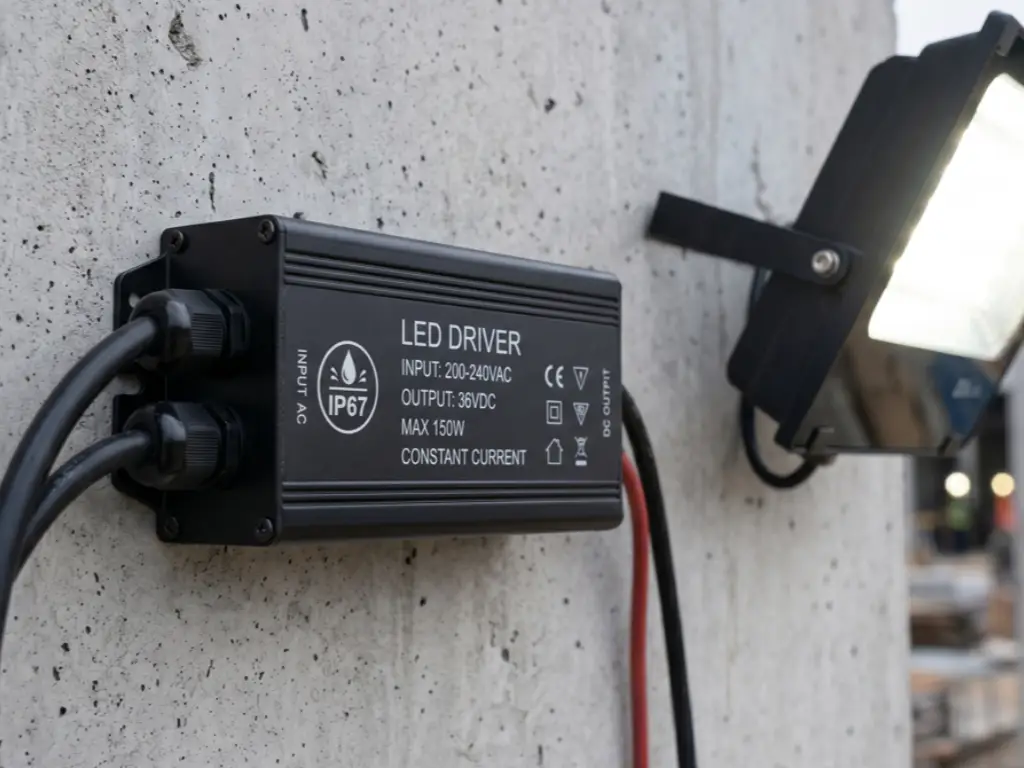
The ‘Dirty Light’ Mystery: Why Not All 3000K LEDs Are Created Equal
One common complaint of lighting procurement is so-called “Dirty Light” when LEDs claiming 3000K start giving varying green or pink color. This is due to the fact that low-end manufacturers do not have tight standards when it comes to color-sorting and there can be a very broad range within one bin. Budget suppliers may combine diodes that occupy diametrically opposite positions in the spectrum of colors, instead of combining LEDs with similar outputs. When such lights, which can be crucial for effective task lighting, are mounted adjacent on a clean white wall or a clean white ceiling, the slight variations will seem glaringly on the wall or ceiling to provide a patchwork effect that gives the appearance of a high end project being out of control and inexpensive.
Greater accuracy of lighting to protect the aesthetic permanence of a design is necessary. This requires a producer whose testing is stringent to fix the inconsistencies that skew your original purpose. The fact that you select a partner who believes in technical precision keeps your project prestige safe of visual flaws and a united and high-end glow.
Beyond the Label: Technical Specs Every Smart Buyer Should Know
In order to maximize your 2700K and 3000K lights on the Kelvin scale, you have to consider the quality of light behind them, and not the nominal color temperature. The technical requirements, which are printed on a product label are just the minimum part; they do not consider the spectral richness or the stability of the light over time. Two lights can be marked with the same label of 3000K with a significant difference in their capability to reproduce colors (CRI) as well as be consistent over time.
1. Color Rendering Index (CRI) and the R9 Value
CRI measures how accurately a light reveals colors. For a professional project, CRI > 90 is a must. However, many lights, including halogen bulbs, have high CRI but a low R9 (Red) value. Since red is vital for skin tones and wood finishes, a low R9 makes people look pale and rooms look “grey.” A smart buyer always asks for the R9 value—it should be above 50 to ensure the space feels “vivid.”
2. Luminous Efficacy & Visual Comfort
Lighting is not only about being bright but being able to control it professionally. A design failure is a 3000K light that provides glare. Find fixtures with highly-controlled reflectors that conceal the source of the light, and so create a soft light that fills the room without making the occupants blind. This is especially essential in retail stores and hospitality settings in which comfort is of utmost importance.
Achieving this balance of technical precision and visual comfort across diverse scenarios requires a manufacturer with deep industry heritage. Drawing on 30 years of manufacturing expertise, WOSEN offers a versatile color temperature range—from warm white (2700K) to cool daylight (6500K+). By integrating state-of-the-art testing laboratories to ensure strict color consistency with premium chips from brands like CREE and Osram, WOSEN ensures that its extensive product line delivers the reliable performance and professional aesthetics your project demands.
Long-Term Performance: Heat Management and Color Stability
The quality of LED lighting has many distinctive features, and its durability is one of them, but only when the heating is performed appropriately. LEDs are sensitive electronics. They employ phosphor coating in order to create the warm light of 2700K or 3000K. When a bad material (such as plastic, rather than high-grade aluminum) is used to construct a fixture, it gathers heat and bakes the phosphor.
After more than 12 months, you will see the Color Drift: your nice 2700K light begins to change to a sickly cold blue. This is the reason why it is essential to invest in high-end housings that provide clear lighting. Interestingly, the same philosophy of manufacturing employed in premium glass, i.e., high-quality production lines cut down the material waste by 15 to 25 percent, is applied to the lighting. Enhanced engineering implies that it requires less material to conduct more heat, and thus your 3000K selection will remain 3000K over the next several years. Consistency is not merely a characteristic, but a long term performance requirement.
Conclusion: Making the Final Decision for Your Vision
The color temperature characterizes the nature of a space, with the 2700K being the gold standard of creating the coziness of the ultimate home, and the 3000K is the better option for the modern feel and clarity of the image, with all the architectural elements that should be revealed by a light source. Nevertheless, the mood as given by the color depends on the manufacturing excellence as it defines the accuracy of the elements. The purity of the professional design is dependent on stable and consistent light that is not affected by the dirty light shift in lower-quality fixtures. The only method of assuring the hue, which you are specifying today to be the same over the years, is through accuracy in production.
Whether you are a home owner designing a new sanctuary or you are an engineer designing a large scale commercial development, being a direct source manufacturer of high-quality LED light products, we give you accuracy and consistency in your projects. Contact WOSEN today with request of sample units and technical specifications of your vision.